Today we are taking a look at the Contemporary Classic designs of the London-based interior design director Sophie Paterson. Sophie established her interiors company, Sophie Paterson Interiors, in 2008 at the age of 23 with no formal training but with plenty of good taste to spare. She got her start in the design business when she had a developer over at her home to look at some plans she was considering. He liked her decorating style so much that he asked her to do some work for him on his latest project. She ultimately was given full design direction without any budget constraints and allowed to design the interiors of a large townhouse renovation with a basement extension. Through working hands-on with the developer and his team of engineers, carpenters, and builders she was launched.
Since that time, Sophie has developed her company into one of the UK’s most successful interior design studios working on high-end projects in both the commercial and residential sectors across Britain and Europe. She even published a book, Style & Glamour, which is filled with images from her projects that not only acts as a portfolio but also provides information and inspiration on how to create her signature Contemporary Classic interiors. Together with her experienced team of talented design professionals, Sophie provides a personalized, relaxed design service. She plans each project herself and gives it over to her design team who manage it. Her style is both timeless and contemporary, with an expert use of color and texture and an innovative eye for design and approachable luxury.
For our design inspiration today, we are taking a look at a spacious five-story classic townhouse redesigned for contemporary life.
CONTEMPORARY CLASSIC DESIGN INSPIRATION
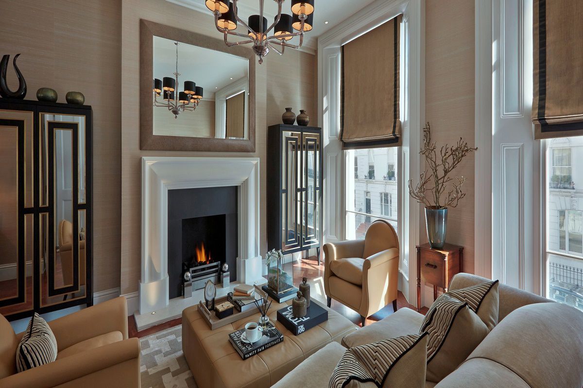
Sophie spent two years immersed in the transformation of this five-story Chelsea townhouse that once belonged to David Bowie in the 1970s. She completely reconfigured the 1860s residence working closely with the owners to create a unique and glamorous home that reflects their very particular taste.
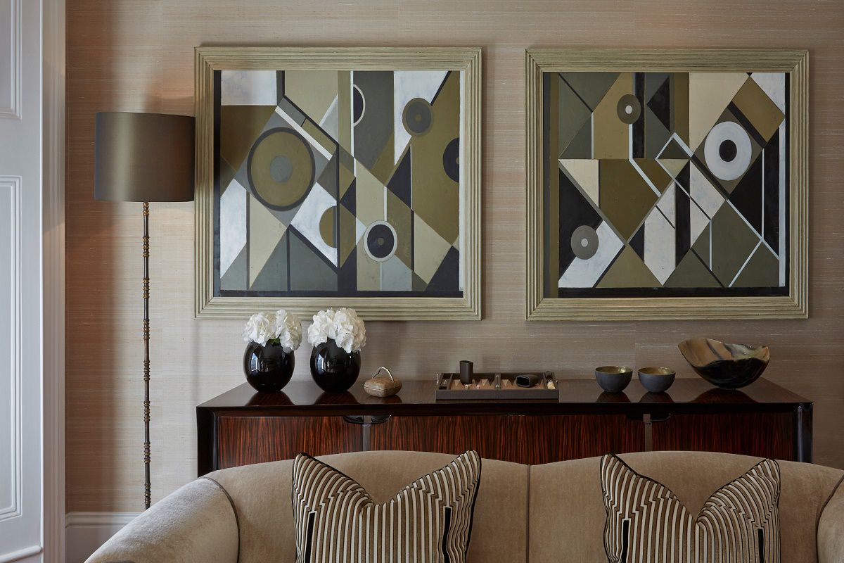
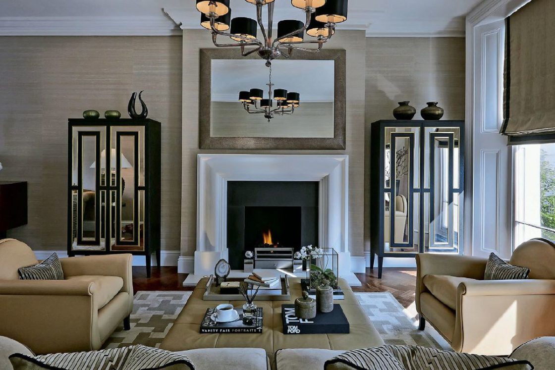
A mix of antiques and contemporary furnishings fill the first-floor formal living room. The owners wanted a design that appeared as though it had been collected over time and not necessarily by a professional designer. The light-filled room features warm colors, rich textures, and luxe finishes. Silk lines the walls to add a bit of luxury. Geometric shapes emphasize the lines of the period architecture. The mirrored, antique brass and ebony cabinets on either side of the fireplace are from Birgit Israel. The leather furnishings are from Poltrono Frau.
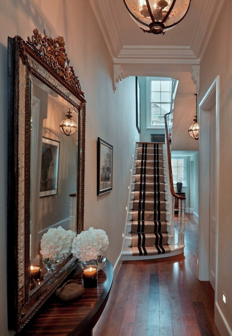
On the ground level, guests enter the home here in the grand entrance hall with its high ceilings and period detailing. The generous space allowed for the modern pendant chandeliers from Jamb. The designer sourced the antique mirror from a favored local antique shop which she placed above a newer Macassar ebony console. This is a perfect example of combining the best of classic design with elements of contemporary design for a space ideally suited for today’s lifestyles. That is the key to creating Contemporary Classic designs. The hall leads into the very glamorous kitchen and dining room which spans the entire floor.
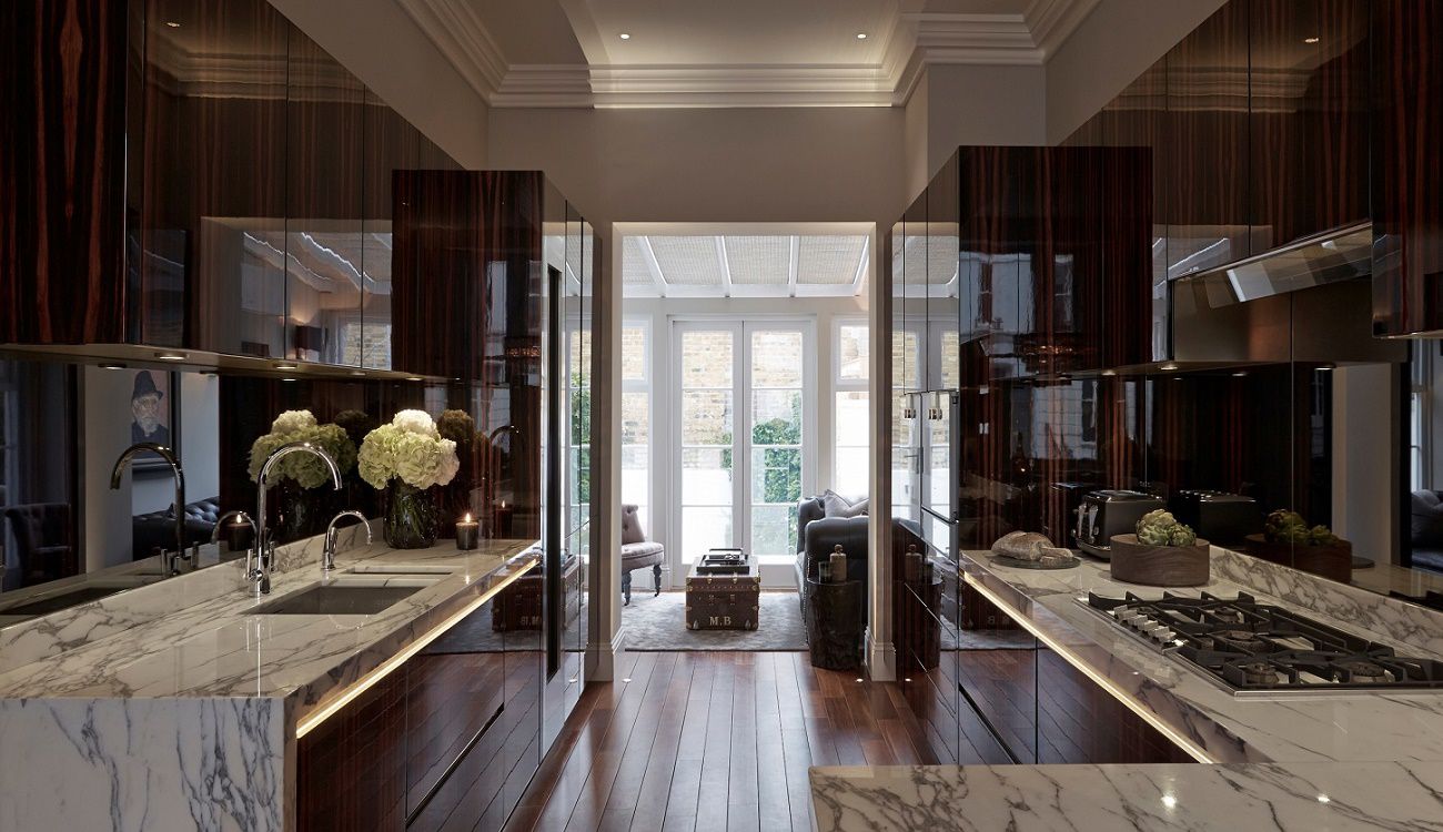
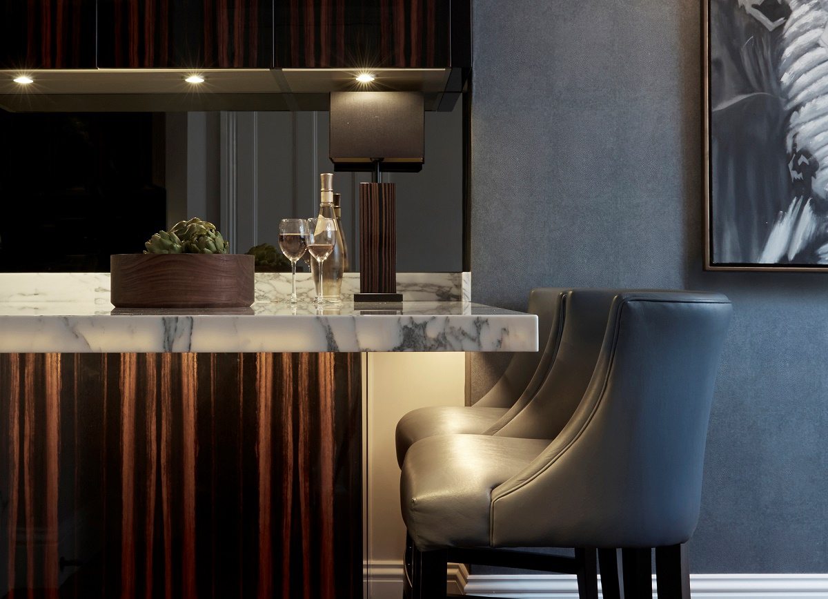
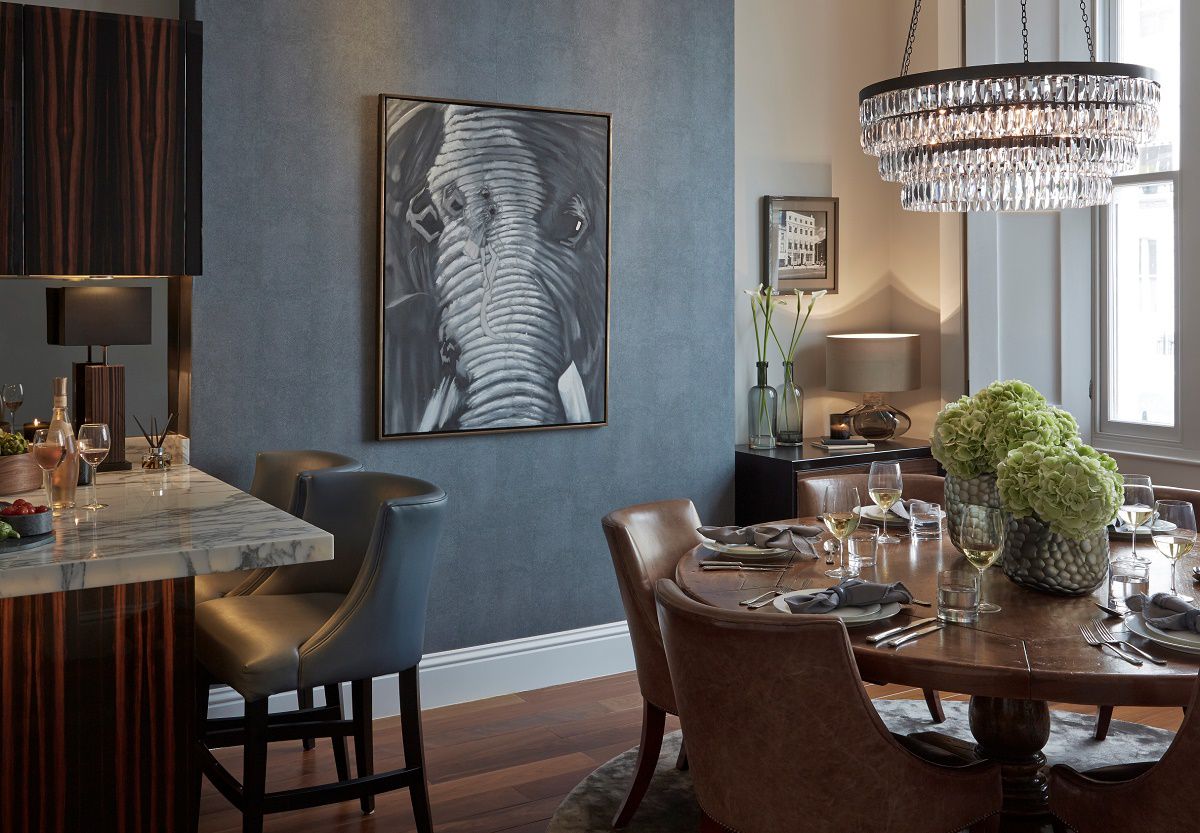
The kitchen is of complete bespoke design by Sophie Paterson Interiors. The Macassar ebony, Arabescato marble, and smoked mirror kitchen take inspiration from the Tom Ford makeup boutique in Selfridges. Gaggenau appliances blend harmoniously with the bespoke cabinetry. Low-level lighting complements the sophisticated design. An eat-in bar separates the kitchen and dining area. The dining area includes a blue faux shagreen feature wall. The dining table came with the house, left by the previous owners. Both the new owners and the designer loved it and decided to keep it. Beyond the kitchen, a small sitting area with French doors opens onto a paved garden with raised flower beds.
On the lower basement level, there is a guest bedroom with bath, a utility room, and a cozy home cinema.
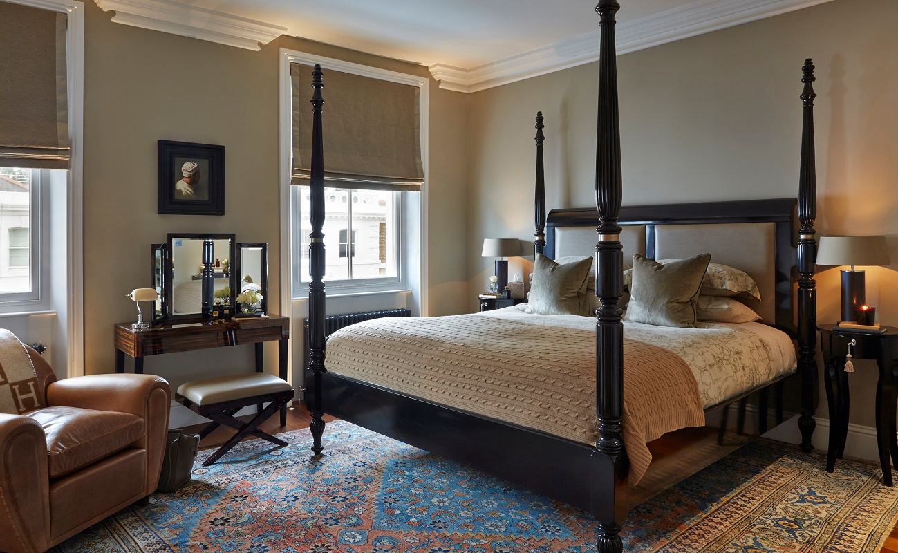
The master bedroom suite is on the next level. The look is very Ralph Lauren with a Ralph Lauren Home oversized four-poster bed serving as the focal point. The room includes a Poltrona Frau leather armchair and a Macassar ebony dressing table, all gathered on an antique rug. Taupe leather upholstered wardrobe doors with bronze handles create another layer of texture and luxury. The mood in the bedroom continues into the bath with Zoffany damask-covered walls and bronze Heathfield lamps.
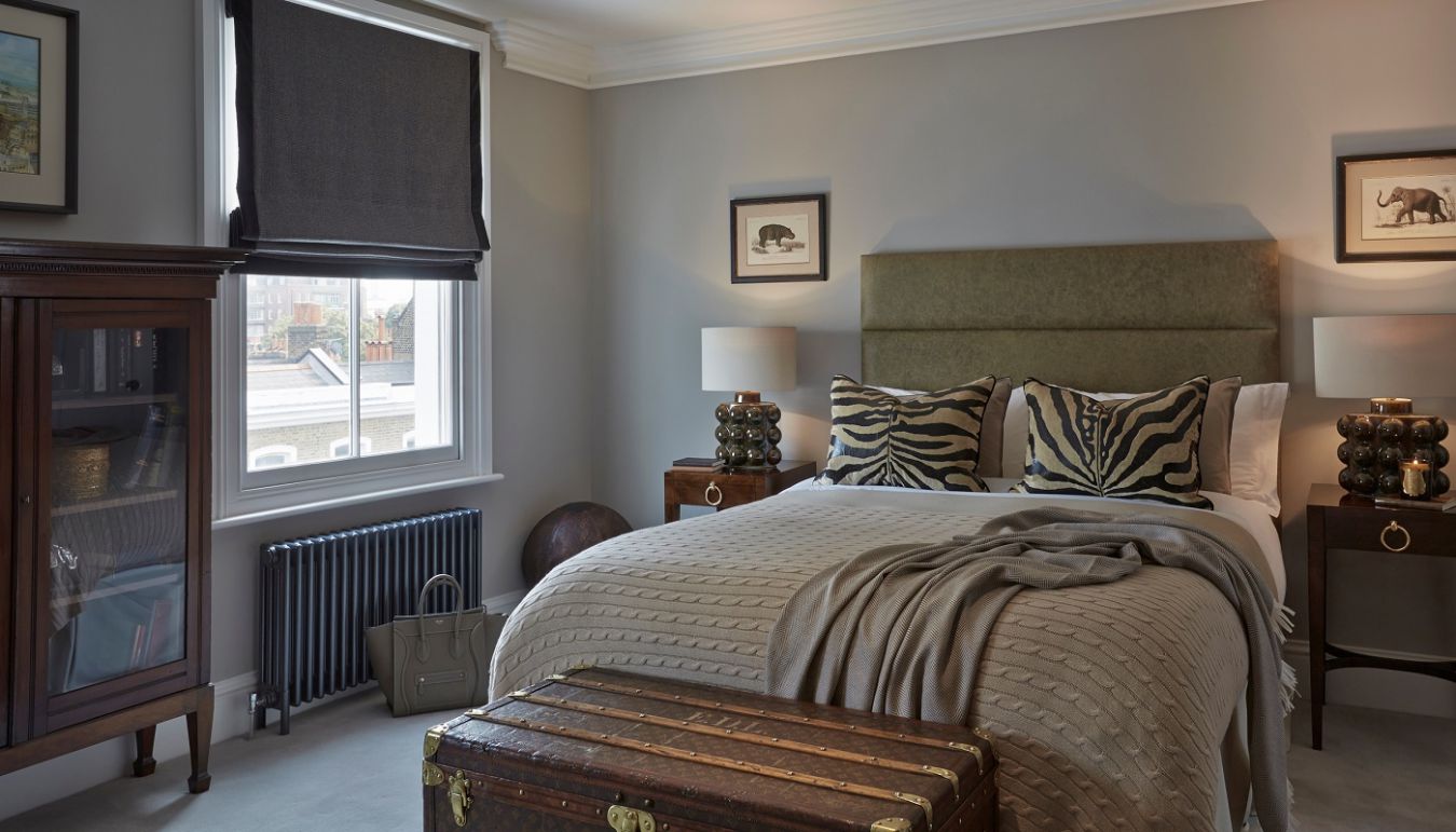
Guest bedrooms make up the remaining top floors. The soft neutral colors and textures continue. Here we see more bedding from Ralph Lauren Home paired with zebra print Andrew Martin cushions. The bedside tables and lamps are from Porta Romana. At the foot is one of several antique collectible Louis Vuitton travel trunks placed throughout the home. The trunks are an ideal touch to imbue a contemporary room with classic style and elegance.
The house completes with a rooftop terrace with Alexander Rose furnishings. The outdoor space provides a quiet get-away along with views across London.
That concludes our design inspiration for today, my friend.
For more Contemporary Classic design, be sure to see:
Contemporary Classic Design: Laura Hammett
Contemporary Classic Fusion: Louise Bradley
Sophie Paterson’s Contemporary Classic Design
It is no wonder Sophie Paterson Interiors has made its way to the top. She has a natural eye. She is an example to support the idea that one either knows design or they don’t. Style, taste and a sense of what is correct are mostly innate gifts that one learns to channel.
Interior Design: Sophie Paterson Interiors
Photography: Ray Main
Thank you so much for reading along with me. What do you think of this contemporary classic design? I look forward to hearing from you in the comments!
Have a great day!

Comments
Great new designer. I am very impressed. I have to respectfully disagree with you about having luxury branded items about the house. I think their presence undermines a sense of style by substituting consumerism for taste. My mother’s Hermes handbag is the predecessor to today’s Constance-it is devoid of visible logos- and despite being used for years upon years- in pristine condition. The ubiquitous Hermes throw with it’s huge H looks like it belongs under a saddle. As always you pick great interiors to show your readers. Thank you!
Hi Abby…Thank you so much for your comments!! We appreciate you so very much for reading along. LOL! The statement you noted was more of a poetic observation than an absolute idea.